The Identity
Contents
Aesthetic Line
Jorge Luis Valverde-Bartlett Brand is a sophisticated, vintage-inspired brand that seamlessly blends the intricate elegance of Art Nouveau, the nostalgia of retro design, and the bold simplicity of a black-and-white color scheme. This aesthetic pays homage to the ornate beauty and detailed craftsmanship of the late 19th and early 20th centuries, capturing a timeless allure with a modern twist. The brand celebrates artistry, refinement, and the subtle drama of monochrome, appealing to individuals who appreciate classic elegance and artisanal detail.
Key Elements
Styles
Photography
Creative Personal Photo (color)
The VIS brand would embrace a rich, dreamlike aesthetic emphasizing fluid, organic shapes and natural beauty for the color photography style. This technique uses grainy textures and muted colors with a slight sepia or vintage wash to evoke a sense of nostalgia and artistry. Lighting would be diffused, giving subjects a gentle, ethereal glow reminiscent of old paintings. This style is ideal for creative campaigns, advertisements, or digital content where the goal is to evoke emotion and artistic appeal.
Creative Scenes Photo (black and white)
My brand would adopt a more natural, documentary-style approach, highlighting the simplicity and beauty of raw textures, shadows, and shapes. This style emphasizes the drama and elegance of high-contrast lighting, using natural or minimalistic studio light sources to create depth and texture. The monochrome palette highlights the craftsmanship of details, from the intricate designs on a product to the organic lines in a person’s expression. This style is perfect for showcasing activities, environmental portraits, or brand storytelling, conveying authenticity and heritage in a refined and understated way.

Typographic Style
Color Style
Primary Color Palete
Methodical
Efficient
HTML: #242424
CYMK: 71% 65% 64% 71%
Logical
Deliberated
HTML: #949494
CYMK: 44% 36% 37% 2%
Impressive
Movement
HTML: #0024f5
CYMK: 87% 77% 0% 0%
Secondary Color Palete
Seasonal Black
RGB: 10 0 0
HTML: #000000
CYMK: 100 100 100 100
Yellow Kthk
RGB: 20 0 0
HTML: #440000
CYMK: 100 100 100 100
Pink Kthk
RGB: 20 0 0
HTML: #440000
CYMK: 100 100 100 100
Green Kthk
RGB: 20 0 0
HTML: #440000
CYMK: 100 100 100 100
Red Kthk
RGB: 20 0 0
HTML: #440000
CYMK: 100 100 100 100
Illustration Style
Download or share illustrations from our curated gallery
Infographic Style
Editorial Rules
Font sizes
Logo Positioning

Stationery
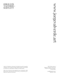
My stationery is simple and powerful, clearly explaining who I am. The visual system conveys a sense of order and formality, balancing typography, photos, and ornaments. Each graphic piece was carefully considered, with each element harmoniously contributing to the overall scheme.

Social Media & Digital Content
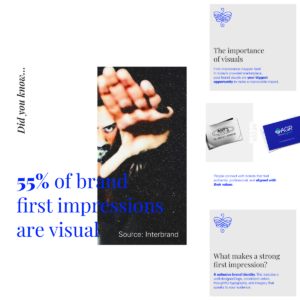
These visual assets can be used in any digital channel, in an internal communications strategy, and help build a brand voice.
Templates
Brand Content
Seasonal & Holidays

Marketing Collaterals
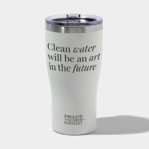
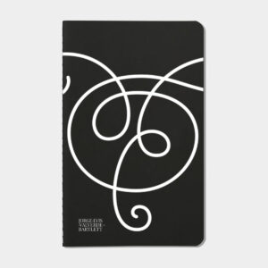
These are digital or printed materials used to communicate or promote a company’s brand message, products, or services.
